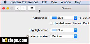
By default, Mac OS X Yosemite and El Capitan use the light theme for the menu bar at the top, and translucent dock at the bottom of the screen. That color scheme can be changed to the really sleek-looking dark theme. I'll also show you how to switch between blue and graphite (dark gray) for buttons / menus / windows, and even use a custom background color for highlighting.
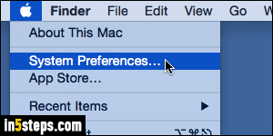
Color theme is a user-specific option: changing it only affects the user account into which you are logged in, no-one else's! Click on the Apple logo in the top left corner of the screen, and choose System Preferences from the menu.
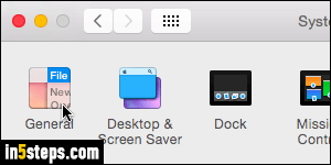
When the window opens, click on the General options - very first button on the left, which controls the system's user interface appearance and behavior.
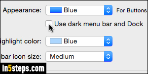
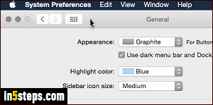
To switch to the dark theme, checkbox the "Use dark menu bar and Dock" checkbox: the change takes effect immediately. While you're at it, change the Appearance dropdown above from Blue to Graphite, to see if you like that look. (It goes well with dark mode, but looks a bit blend.) Finally, the Highlight color dropdown lets you determine which color will be used to show that an item is highlighted - like clicking to select a file, or dragging to select text.
Try clicking a file or folder on your desktop, and launching TextEdit to preview your new text highlighting background color. If you don't like these colors, or dark mode, just switch back to the defaults. To contrast dark theme with graphite color and light theme with blue, compare this screenshot with the first one! Once done, you can close the System Preferences window (Cmd+W).

