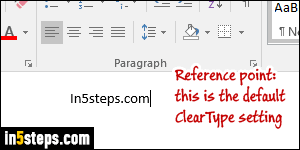
By default, Windows 7 makes text easier to read on screen using what Microsoft calls "ClearType", generically known as "font smoothing" or "anti-aliasing". Without it, most fonts have jagged edges, making them much harsher looking. With ClearType, the corner of each letter's "glyphs" uses semi-transparent pixels to make them more rounded. Possible downsides of this technology include demands on the graphics card / GPU, and font problems.
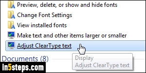
To access your font smoothing options, type "font" in the start menu's search field, and click on the "Adjust ClearType text" link under Control Panel.
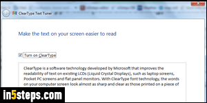
This will open the ClearType Text Tuner dialog: the "Turn on ClearType" checkbox is checked by default. Uncheck it to turn off ClearType: you can close the window right away, or adjust other font smoothing settings. Click Next, choose your screen resolution setting, and click Next once more. Go through the adjustment stages to pick the best anti-aliasing options for your monitor.
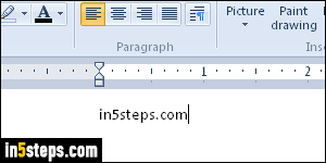
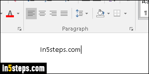
Some applications and web pages won't reflect the change until you restart them. Also note that some programs (the Google Chrome web browser and now-discontinued Safari for Windows are examples, as are many apps written in Java) include their own subpixel rendering algorithms, built right into the app - these programs will ignore your Windows ClearType settings. The screenshot shows the same text as the first screenshot, but without ClearType.
ClearType is Windows' top-of-the-line font smoothing option. You still get a lighter anti-aliasing effect after you disabled ClearType. To turn off all font smoothing, type "advanced" in the start menu and select View advanced system settings. Click on the Performance button, scroll down to the bottom, and uncheck the Smooth edges of screen fonts checkbox. Click Apply to preview the change: your text is now "raw" - no extra rendering is involved!

